
In Part 1 of this series, I theorized that nearly every element of a photographer’s perceived needs are really nothing more than his fetishes — and each photographic fetish comes with its own adherents and detractors. I began with a discussion of the camera’s build quality and here, in Part 2, I’ll discuss various imaging fetishes, and how the Monochrom might or might not satisfy some of the more popular fixations.
Color Fetishists
As you might expect, a camera called the “Monochrom” is fundamentally incapable of delivering gorgeously saturated colors. If color photography is your bag, then the Monochrom has no place inside it.
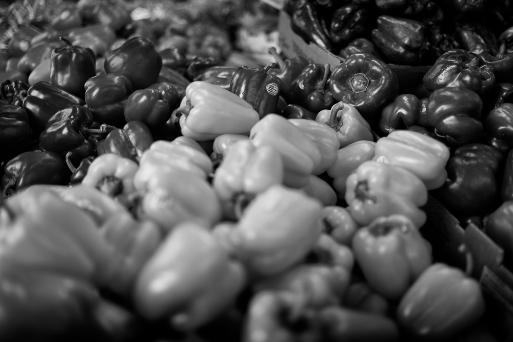
But color fetishism isn’t the sole domain of color photographers. B&W photographers often obsess over color, because color translates into luminosity and tonality in a black and white image. In the film era, photographers often selected one film stock over another because of differences in their color interpretations. Similarly, B&W photographers always stocked a wealth of colored filters, knowing that a filter applied to the front of any lens would alter the scene’s relative contrast. For example, in the following photo I used an orange filter to drastically darken the bright blue sky, which I knew would be the predominant “color” in this photo. As contrary as the notion might seem, being a good B&W photographer once required having a much better understanding of color than many color photographers.

For this reason, one of the first things I did when I got the Monochrom was to run a series of tests to see how it responded to color. I had to know how the Monochrom “saw” color, so that I could train myself to see it in the same way.
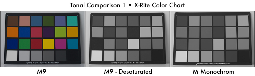
The first thing I noticed when comparing output between the M9 and the Monochrom was their exposure difference. Specifically, when using the same lens and identical exposure settings on both cameras, shots from my M9 were consistently a half-stop less exposed than the Monochrom. The second thing I noticed was that a desaturated M9 shot looked nothing like a Monochrom shot — the M9 exhibited greater tonal contrast across a scene. Although you might think this is a good thing, it’s not. Too much contrast allows too little room for manipulation. By starting with a richer, smoother greyscale, there’s more opportunity to adjust an image’s tonal balance to your liking. When it comes to black and white, starting with a greyer image is, for me, preferable to starting with a contrasty image.
The following comparison shows an X-Rite color chart photographed with an old Leitz 50mm thread mount Elmar lens. On the left is the color version, as photographed by my M9. On the right is the same chart, as photographed by the Monochrom. In the middle is a desaturated version of the M9 file after adding a 1/2 stop exposure adjustment in Lightroom. Notice how the desaturated M9 image has much more built-in contrast — with much darker blues and much lighter yellows than the Monochrom file.
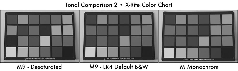
Next, I compared what happens when I let Lightroom perform a default B&W conversion on that same M9 file. On the left is the desaturated M9 file. On the right is the Monochrom file. In the middle is the default Lightroom B&W conversion. Notice that this file interprets color much more like the Monochrom, but with numerous subtle differences across the various colors.
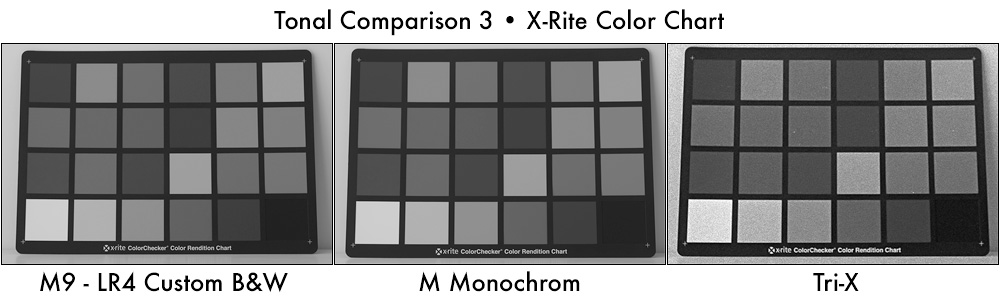
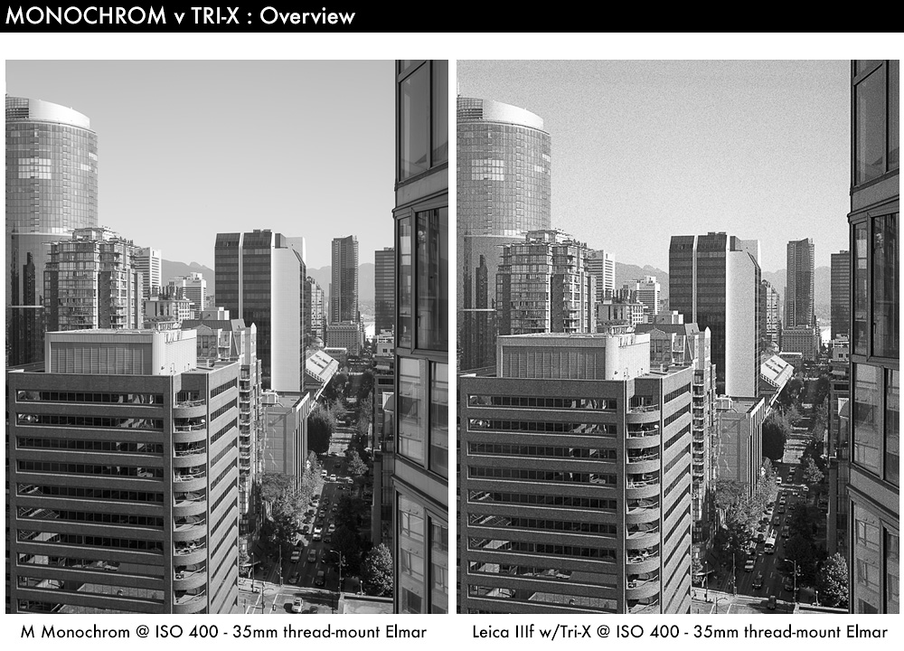
Finally, I spent some time tweaking Lightroom’s B&W color conversion parameters to yield an image as close as possible to the one from the Monochrom. In the following comparison, you can see my custom results in the left image. In the center is the Monochrom output. Notice that they are nearly identical now. Furthermore, I shot the same color chart using the same 50mm Elmar lens mounted on my Leica IIIf, which was loaded with Tri-X (and which I developed in Rodinal). The Tri-X color rendering is shown on the right. It’s very similar to the Monochrom rendering, varying only slightly in the way it interprets greens. This is a good thing since my experience shooting Tri-X means I’ll have a pretty good idea how colors will render in the Monochrom.
The custom color-conversion preset that I created in Lightroom proved very useful for further analyzing differences between M9 files and Monochrom files, since it “levelled” the playing field — minimizing exposure and tonal differences between the two cameras. Some of these comparisons will be discussed further when other fetishes are addressed.
Film Fetishists
Now that we know the Monochrom has a color response that’s reasonably similar to Tri-X, it’s only fair to ask the next logical question: do images from the Monochrom look anything like film? This is a slippery slope, since film has a long and storied existence, and is thus laden its own fetishes, feuds, facts and fictions.
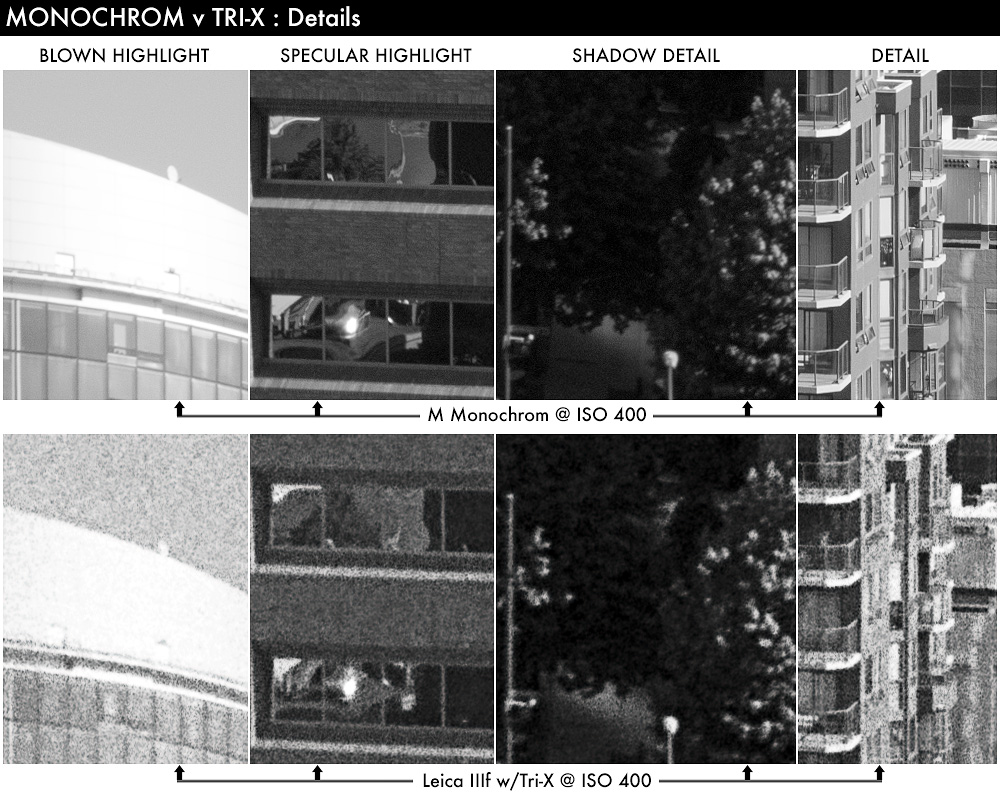
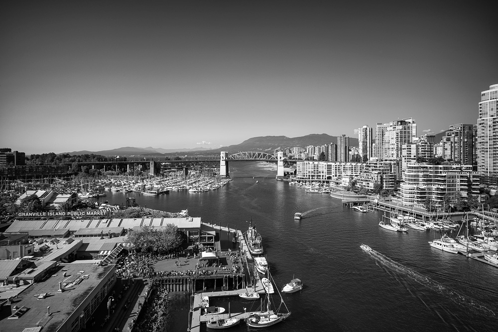
In order to at least hint at the answer, I again took to comparing shots from the Monochrom with shots from my Leica IIIf. (NOTE: Should anyone wonder why I used the IIIf and not my M2 or M6TTL, it was simply a matter of access — both film M-bodies were loaded with some rather specialized film stock, but my IIIf had a roll of Tri-X inside and a few remaining exposures to burn). In order to minimize the differences between Monochrom files and Tri-X files, I performed these comparisons with old Leica thread-mount lenses, since they’re easily adapted to the Monochrom. Similarly, since I’d been exposing the Tri-X at ISO 400, I chose to set the Monochrom’s ISO to 400, as well. I used a tripod to minimize any external vibration and insure that both cameras would photograph the same scene from the same angle. The photos you see below were taken about 30 seconds apart, using identical exposure settings and the exact same lens.
So what do we see? Other than the Tri-X being obviously grainier (a side-effect of some aggressive Rodinal development), we don’t see a whole lot of tonal difference. The midtones render almost identically. The Tri-X shot has, perhaps, a tiny bit more contrast — but these are unaltered, straight-from-camera (or scanner) files. Any such subtle difference could be quickly altered with only the slightest nudge of a gamma curve.
The differences become more apparent when we pixel (grain) peep, and the following series of comparisons allow us to do exactly that:
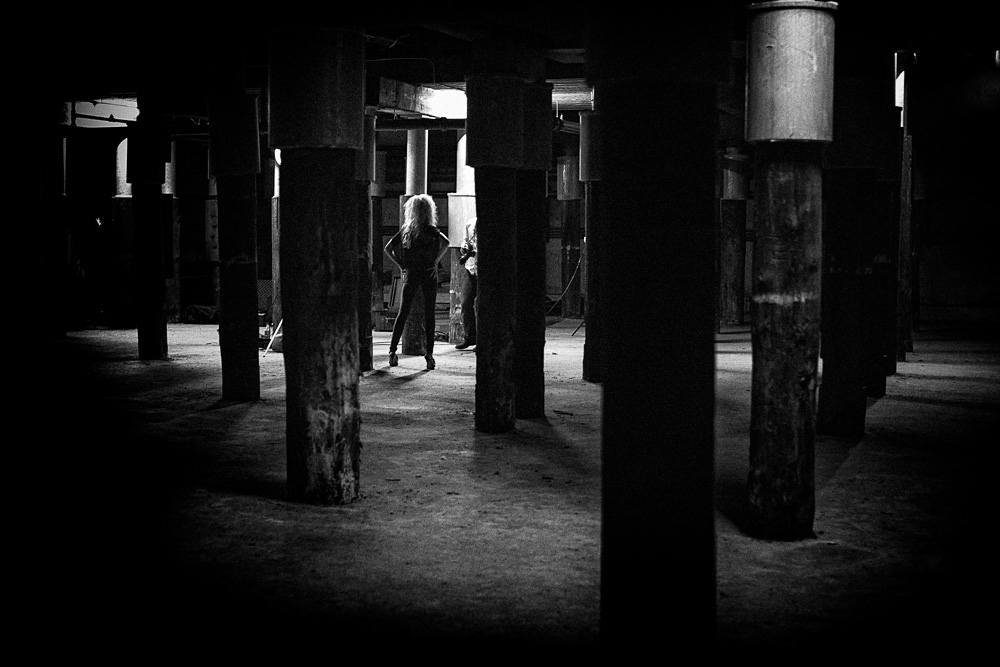
The left column contains a detail from the top of the high-rise at the left of the frame. This part of the structure is clad in highly reflective metal panels, and a large section of this area completely blew the highlights on the Monochrom. The top image shows this blown-out area in the Monochrom file, and the bottom image shows this same blown-out area on the scanned Tri-X negative. (NOTE: For the edification of detail fetishists, I should mention that I scan my negatives using a Plustek 7600i scanner with SilverFast Ai Studio 8, and optimize each scan to extract the full dynamic range from each negative, which I then store as a 16-bit greyscale TIFF file). Frankly, I expected the Monochrom’s blown highlights to look somewhat posterized and the Tri-X’s to appear more gradual. This was not the case — both files gracefully handled the overexposure in a very similar way.
The next column contains another blown highlight detail — this one a specular highlight from a reflection in some building windows. Here, perhaps, we see a slight bit of posterization in the clipped region of the Monochrom file, while the Tri-X seems to clip ever-so-slightly more gracefully. But is that really the case, or is it just a side-effect of the Monochrom’s extreme level of detail?
The third column contains an extraction from the lower-right corner of the frame — where the sidewalk and trees are cast in deep shadows. Again, save for the fact that the Monochrom file is so much cleaner and more detailed, the two files contain almost identical amounts of shadow detail.
The right column is merely a random detail, which I extracted from the center of the frame. Again, we see almost identical tonality, but the Monochrom file is simply in another class when resolution is considered.
I must admit that I’m a bit of a film fetishist myself — in fact, prior to the Monochrom’s arrival, I’d shot more film “keepers” this year than I’d shot digital — the first time in over a decade this has happened. Please don’t interpret this statement as fodder for the ever-tiresome film vs. digital debate — it’s not. I shoot and love both, because both have different characteristics. So what are the characteristics that make me still use film? And will the Monochrom allow me to repurpose my stainless developing tanks into stylish storage containers for screws, coins and buttons?
There are two reasons why I sometimes grab a film camera on the way out the door. The first is film’s tonality, and its response to light. The Monochrom definitely closes the gap here, but it doesn’t quite eliminate it. There are still differences with toe and shoulder response that, in some “real-world “situations, make me choose film. Note that I define “real world” as meaning “oops, I really screwed up the exposure on that shot!” And in these conditions, film’s unique toe and shoulder response curves completely save my butt. If I were more in control of my exposure, I wouldn’t hesitate to claim that the Monochrom could effectively eliminate the tonal advantages I get from film. But on the streets, where photo opportunities occur so quickly that I have to “make do” with dubious exposure and even more dubious focus, film remains somewhat more forgiving, and thus a viable medium.

The second reason I’ve been shooting more film is simply that I really like grain. My photos are often heavily flawed and, frankly, once I’ve drifted so far from perfect image quality, I adopt a “more the merrier” attitude when it comes to the presence of additional flaws. That’s why I like higher speed films, and it’s why I develop that film in Rodinal, rather than in some lower acutance developer. One look at the detailed “Monochrom v Tri-X” images shown earlier will tell you that “grain” is not something I’m going to get from a Monochrom file.
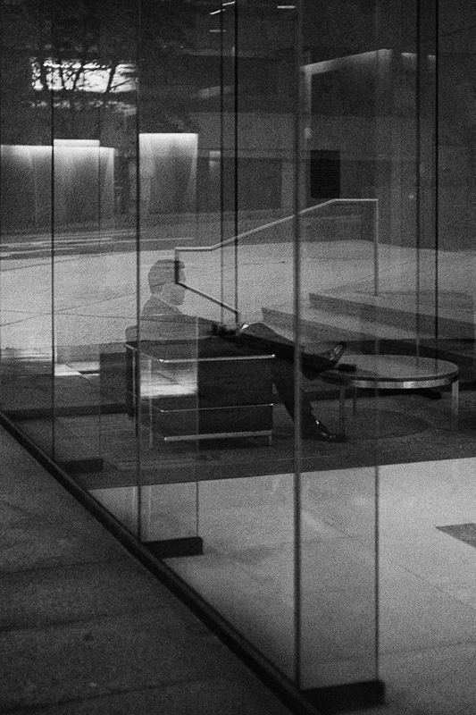
In truth, when I shoot in dark environments and pump up the ISO, I’m almost dismayed by the Monochrom’s low noise floor. I expect images shot after sunset to be grainy — but the Monochrom remains spectacularly clean. There are, of course, grain emulators built in to today’s software, and the simulations in both Silver Efex Pro and Lightroom are quite capable, providing you use them carefully and intelligently. One advantage of the Monochrom is that any noise it does contain is a bit more like a dusting of static than a jagged assemblage of digital artifacts. So I’ve taken to adding a bit of artificial grain to the Monochrom’s high ISO shots — simply because this is how I expect these images to look, and the absence of grain seems somewhat strange to me.
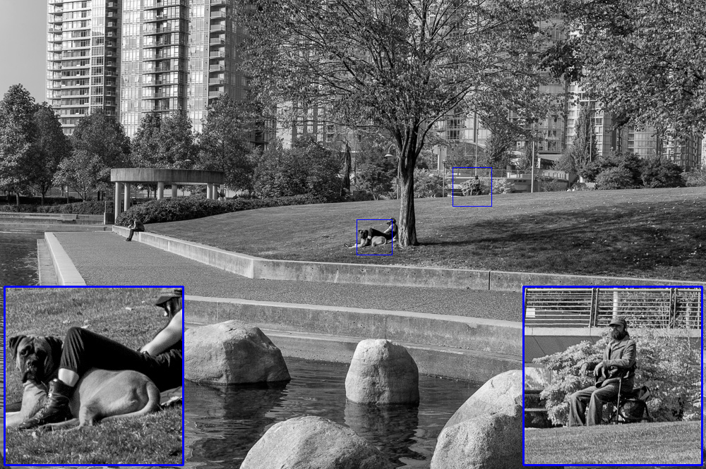
The earlier image of the man sitting in a chair is a prime example. That photo was taken at dusk using ISO 1600, yet it was smooth as a double shot of Patrón. It’s not the way I wanted the image to look, so I “roughed it up” a bit in software. Let’s just say that it’s far easier to rough up a high-fidelity file than it is to polish a low-fidelity file. So is this cheating? I’ll leave it to the debaters to debate. Meanwhile, I’ll be out shooting the heck out of the Monochrom, and enjoying every second of it — even if it’s not film’s exact digital doppelgänger:
Ultimately, if you want something that looks like film, feels like film and smells like fixer, then let me point you to a little website called “eBay.” There you’ll find all manner of film cameras just waiting for a new home and a loving owner. If I owned a Monochrom, I would still continue to shoot film, but I’m quite certain that the quantity of Tri-X flowing through my cameras would drop precipitously. The fact that the Monochrom’s fidelity is higher (and its noise floor lower) than any camera I’ve ever used (film or digital) is not something to take lightly. In spite of its film-like tonality, the cleanliness and detail contained in these files still make them appear uniquely digital. Is this good or bad? That depends totally on you, your fetishes, and how flexible you are.
As I speculated in an article called Hatch Battening, which I wrote for ULTRAsomething, the Monochrom indeed has its own look — its files are cleaner, richer, sharper and more detailed than my M9, which makes the Monochrom a very enticing alternative to simply post-converting a color file. If a very realistic film “look” is what you’re after, the Monochrom won’t quite give it to you — but its capacity to give you so much more is not something film shooters should dismiss. The Monochrom is its own world — one that’s worthy of exploring for anyone seeking maximum overall fidelity in a black and white image.
Henri Cartier-Bresson Fetishists
At one time or another, we’ve all succumbed to the Henri Cartier-Bresson fetish. If you haven’t, you will. And if you have, it’ll always be with you — at least to some extent. My Cartier-Bresson fetish haunts me every time I consider cropping a photo. I know there’s absolutely nothing wrong with improving an image by cropping it, yet the ghost of Cartier-Bresson always appears and admonishes me quite sternly every time I reach for Lightroom’s cropping tool.
When I think of Cartier-Bresson’s photos, so many factors come to mind — the geometry, the timing, and the rich but subtle grey tonality, which is like a soothing sanctuary from today’s over-amped, hyper-contrast, hyper-reality photos. I have not nearly his eye nor his talent, but the knowledge that such abilities are within human grasp continue to motivate me to at least try.
Leica, too, was influenced by their own Henri Cartier-Bresson fetish when they developed the Monochrom, which they code-named “Henri” during its development cycle. Curiously, this knowledge had a major impact on the lenses I often chose for my time with this camera. I figured that if Leica was trying to create a digital camera worthy of Henri Cartier-Bresson, the least I could do was use some of the lenses that Cartier-Bresson would have used in his heyday — lenses like my 35mm f/3.5 Elmar LTM and, for maximum authenticity, my 50mm f/3.5 Elmar LTM.
It feels simply amazing to use a tool whose roots extend back nearly 100 years to Oskar Barnack’s first efforts to repurpose 35mm movie film into a still camera. In an age where everything needs to be marketed as revolutionary, Leica understands the value of evolutionary — and that each generation of products doesn’t need to supplant the previous generation, but enhance it. I don’t suspect there are many companies making bleeding edge products (like the Monochrom) that still work flawlessly with system components dating back to the 1920’s. The fact is, if you learned to use a Leica in 1935, you would instinctively know how to use one in 1957, and in 2012 and, most likely, even in 2041. For me, the Monochrom is the purest digital Leica yet, and while technically superior to my old Leica III in nearly every conceivable way, it’s still unmistakably a part of that lineage.
I cannot be so arrogant as to speak for the dear departed Mr. Cartier-Bresson, so I won’t. But as one of his many million fetishists, I believe the Monochrom is a camera well worthy of its intended association.
Sharpness Fetishists
If it’s sharpness ye seek, and ye seeketh not color, then ye may stoppeth thine search. The Monochrom is, without a doubt, the sharpest camera I’ve ever had the pleasure of shooting — it’s biblically sharp (as you can tell from my introductory prose). Of course, it doesn’t hurt that it’s encased within a Leica M body, meaning Leica’s entire historical inventory of truly stellar optics are all available to supply that camera with some seriously wicked fidelity.
I’ll admit that sharpness rarely plays a starring role in my own photography. As a street and documentary photographer, I simply have too many variables working against me, meaning motion blur and missed focus tend to eliminate whatever sharpness advantages exist in my gear. Those with the previously mentioned Henri Cartier-Bresson fetish are all likely nodding their heads in agreement. After all, it was Cartier-Bresson who once famously told Helmut Newton that “sharpness is a bourgeois concept.” But those who dole out commercial photography assignments don’t suffer from Cartier-Bresson fetishes — for them, sharpness isn’t bourgeois, it’s profit.
But every now and then, even for me, sharpness takes on a measure of importance. Consider the following photo. I was standing in sunlight with my camera’s exposure set accordingly when, off in the distance and in the shadow of some buildings, I saw a couple embrace — the man quickly extending his arm to avoid burning the woman with his cigarette. I am forever a sucker for spontaneous displays of affection, so I grabbed the shot — knowing full well I was too far away, had the wrong exposure dialled in, and had only enough time to guess at the focus distance. What you see here is, in reality, a crop (in spite of my imagined admonishments from Mr. Cartier-Bresson) — an area only about 15% the size of the entire frame. Yet, because of the Monochrom’s incredible sharpness (coupled with its shadow detail), I was able to salvage the shot, and get the photo I’d intended.

So, while sharpness is often unimportant to my own photographs, I’d rather have an abundance of it, then too little — and the Monochrom is the very definition of “an abundance of sharpness.”
In Part 3, I’ll continue combing through the various imaging fetishes before segueing into some of the more psychological aspects of Monochrom photography — exactly the sort of stuff that’s guaranteed to set off at least a few rants on photography forums around the world.
-grEGORy simpson
grEGORy simpson is a professional “pounder.” You may find him pounding on his computer keyboard, churning out articles for both the Leica Blog and his own blog at ULTRAsomething.com. Or you may hear him pounding on a musical keyboard, composing music and designing new sounds. Frequently, he’s out pounding city pavement and photographing humans simply being. And that sound you hear? That’s either the sound of him pounding on doors trying to get hired or, more likely, it’s the sound of him pounding his head against the wall when he doesn’t. Fellow pounders are welcome to follow along on the ULTRAsomething Facebook page or G+ account.
Comments (15)